
Buy the map!
This map shows 40 meters of sea level rise. Only 2/3 of the world’s ice sheets melted to produce this archipelago.
This map shows 40 meters of sea level rise. Only 2/3 of the world’s ice sheets melted to produce this archipelago.
You thought you were safe in your desert resort?
 As the oceans rise, the Gulf of California will inundate the Imperial Valley, and finally reach its ultimate level in the Coachella Valley. I imagine there will be far fewer golf courses, but hey, plenty of opportunities for yacht moorage!

Perched at the western edge of the Fraser Sea, the Vancouver Archipelago holds what remains of a great western city.
 This is the fourth in a series of extreme sea level rise maps. The other three so far are Los Angeles, Seattle and Portland.
Help keep this project going–
While at the UW, I created a set of heat maps showing the density of responses to our Campus Landscape Framework survey. The survey asked a number of questions about the preferences and perceptions of students, staff, faculty, and alumni. I took the responses and visualized them geographically…
“Morphogenesis of a Philadelphia City Block”

The first time I mapped out a historical geography was as a young SFSU undergrad. I recently came across this project while looking for old photos in my boxes of personal archaeology. I was thrilled to find it; I thought I had lost it long ago. I was ridiculously proud of this at the time–even though it only took a few hours to put together. When I researched this project, I hadn’t yet learned GIS, so the maps are hand-drawn.
This project was the first of many historical geographies I’ve explored, the last of which was the University of Washington campus.
I’ve never even been to Philadelphia.
Here is my original graphic:

Xeni Jardin at Boing Boing posted this video of some old friends of mine from way back. Laden with nostalgia, I found these in some old boxes of negatives. I just scanned and uploaded them to Flickr today. I haven’t seen most of these people in decades. I hope they’re all doing well.
This is the third in a series of extreme sea level rise maps. Check out my other sea rise maps.

Help keep this project going–
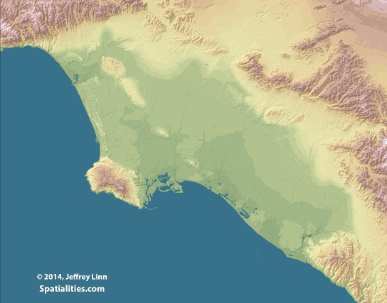
As a follow-up to the Bay of LA map, here’s an animated gif of progressive sea level rise in the LA Basin.
Welcome to Greenhouse Earth–Portland edition. The Portland archipelago awaits your descendants.

Help keep this project going–
Or purchase in-person at Beard’s Framing Shops.
Update: Someone pointed out these maps showing the Missoula floods–Very cool! http://www.oregonlive.com/environment/index.ssf/2012/06/lidar_map_shows_path_of_missou.html